Jagunbae 2.0
This is a translated version of Kang's first essay in the series "How is the Jagunbae website evolving?"
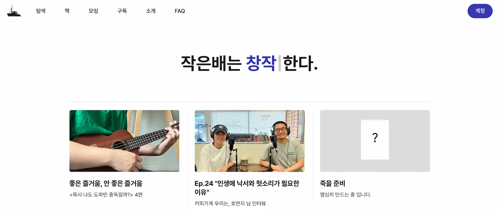
I’ve been running jagunbae.com for more than three years. Thanks to Ghost, an open-source CMS, collecting emails and setting up a newsletter was easy. So far, I’ve sent out over 120 letters, averaging more than one a week. The site has grown into much more than just a collection of our personal essays. As we began to publish podcasts and host workshops, I started feeling overwhelmed by the sheer amount of content.
It was time for a change. Even though it’s only been seven months since I launched Jagunbae, I knew I had to renovate the website as soon as possible.
What should jagunbae.com be? How can it reflect the life we aim for? These questions kept me up at night. Just like a restaurant owner adjusting the layout of the kitchen and dining area, I wanted to rethink what our visitors could take away from the site.
The conclusion was simple: Our website should be simple, welcoming, and fun. It should be easy to understand on the first visit and intriguing enough to make people want to come back.
Simple
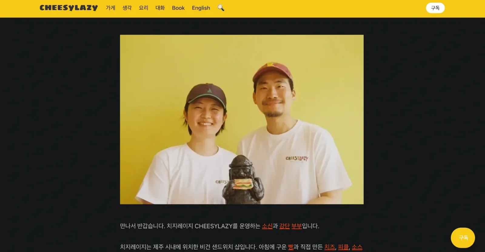
Back in 2021, when we started cheesylazy.com, I wrote about David Chang’s idea of "foreign but familiar flavors." The gist was that people don’t crave entirely new foods; they want something slightly different from what they know, like a twist on a classic cheeseburger. I think this rule can be applied to websites as well.
If the design strays too far from familiar interfaces like Google or Naver, users might not know where to click. So, the design of jagunbae.com is straightforward. The goal is to create a site that even those unfamiliar with the web can navigate easily.
That’s why I didn’t stray far from Ghost’s default theme, Source. All I needed was a stable site where users could subscribe without facing issues. I considered ditching the thumbnails for a more text-focused design but decided to keep them, thinking the featured photos would be more familiar, like on a news site. Similarly, I thought about adding more unique fonts but settled on Pretendard, which I found to be the most familiar and readable font in Korea.
Welcoming
A welcoming website greets all visitors warmly. It’s ready to load quickly on old computers, smartphones, laptops, or large monitors—anywhere, really—without a layout shift. Our website is light and fast. There are no ads and trackers. I’ve compressed every image and minimized script sizes to ensure speed.
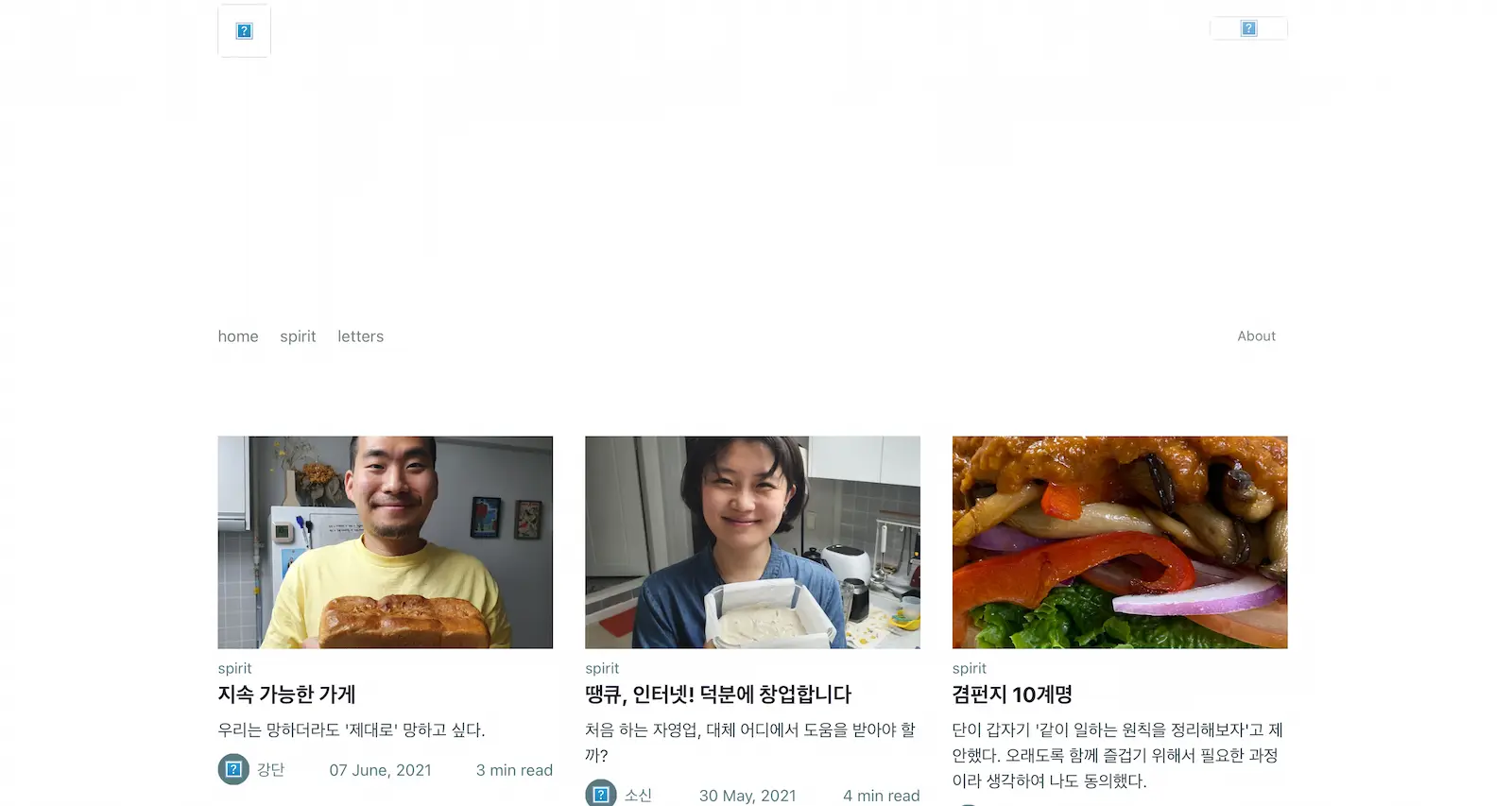
The old website wasn’t very welcoming. It listed hundreds of posts but didn’t organize them well. This time, I made it easy to explore content through a “surf the content" page. In an era where content becomes outdated after just a year, I wanted to keep our older posts from being forgotten. It feels like I've built a library where you can browse everything Jagunbae has published.
Fun
When I installed Tinylytics on the old site, I noticed something: Most visitors who found us through Google or Instagram left within five seconds. They came with low expectations, found nothing engaging, and didn’t see a reason to stick around.
I don’t want to add reels to jagunbae.com, but I do want elements that keep the audience engaged. I want visitors to think, “Oh, this site has personality.” So, I used typed.js for simple animations on the homepage and hid little Easter eggs throughout the site. I want navigating the site to feel like a treasure hunt, where visitors discover hidden gems as they explore.
Jagunbae 2.0
Calling it “2.0” sounds grand, but there’s a 99% chance the changes won’t be huge. I’m just sitting here with the same mindset as when I cleaned, baked, and prepped for a restaurant.
It’s been less than a week since I officially started the revamp. There’s still a ton of work left, like adding more FAQ content, updating the about page, and redesigning the meetup page. There will be plenty of frustrating moments with broken code and mysterious bugs. But what can I do? I’m committed to creating a space that’s familiar, welcoming, and witty. Not flashy, but memorable enough to be worthy of a revisit.